Wedding Invites
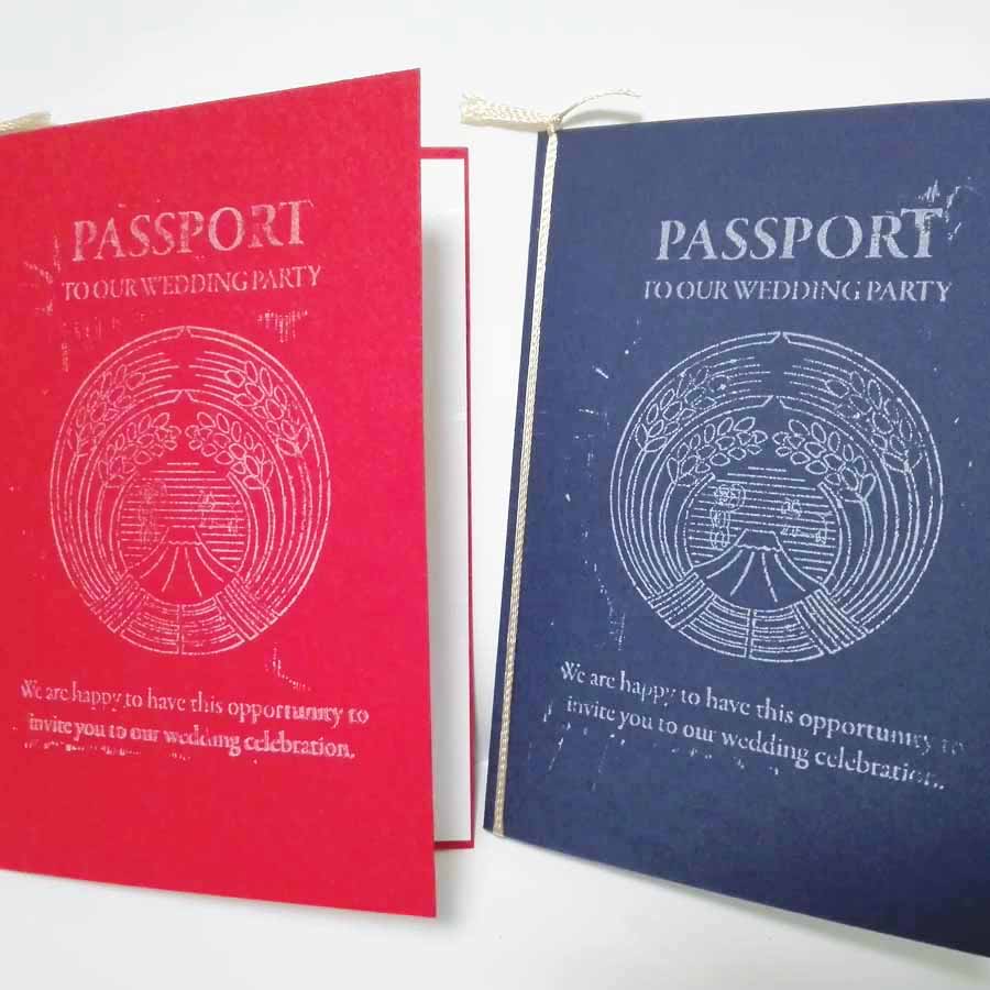
Wedding invitations are one of the most important parts of a wedding, and we looked around for a long time for ideas that suited us, and the (quite popular) passport design fit our International relationship really well, and we could really personalise the design. We shopped around for paper and chose thick card of the Australian and Japanese passport colours, and delicate beautiful Japanese inner paper that had flecks of silver throughout.
We knew the size we wanted, and after playing around with designs for the front we decided we wanted a Japanese style kamon (family crest) on the front. But I don't have a Japanese family crest, so we made one. Graphic design wise, Japanese kamon are really interesting and amazing. We started with a common important element of a kamon, rice strands (very important in Japan) and added something important to European people, wheat strands. Then with some more work in Illustrator copying sketches by my wife, we added some in-jokes.
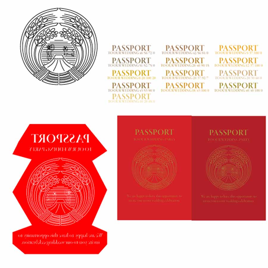
After finalising the design, we first tried printing the design on the front of the invitation with a laser printer, then melting gold foil onto it with a laminator. It didn't work well, even when printed with thick black (plastic) ink so the gold would stick. We changed focus and considered gold paint. I later learned gold paint was a terrible idea, but thanks to my wife, white ink saved the whole project (who knew white stamp ink existed and was possible?). With my experience using a laser cutter, we cut a series of stamps in a wooden chopping board at different depths to find a perfect depth for the resolution of the kamon. The wood was not good quality, so some resolution was lost in loose or uneven grains in the wood, and I didn't etch all the way to the edges (which meant some hand-carving). We had two good quality stamps from the process which we used to stamp all the passports.
Wedding Poster
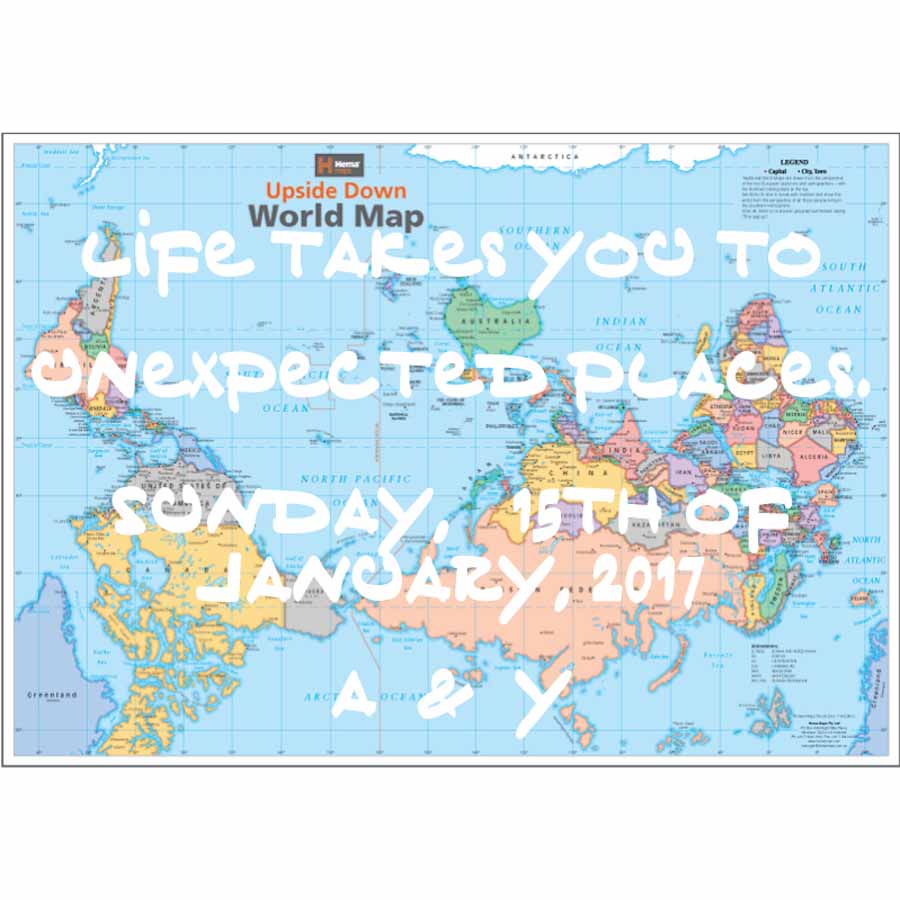
For my wedding we wanted a nice big poster for the venue room that represented our international relationship and that would be very personal. My wife had bought an upside-down world map while she was in Australia a few years ago, and we decided it would be a perfect start for the poster. I was using a laser cutter in Tokyo at Fablab Setagaya/Ikejiri for other projects at the time, and it was perfect for cutting out letters that we could stick over the map. We bought sticky label sheets and after designing the layout in Illustrator I went and cut the pages with the laser cutter.
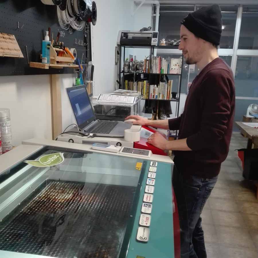
We carefully peeled each letter off the backing paper and laid it out by hand according to our plan, and we did really well (I think) in copying the design from the computer. Having something as easy as a world map as a background helped us a lot. The font we used for the poster is a secret, but it's a great font, it was perfect for our atmosphere and style.
It was really nice going from PC design to tangible laser cut design to hand-craft with this project, I love combining digital and real-life designs.
